Do you know what to include on each ecommerce product page in your online shop?
If you have an ecommerce website, you know how important the product pages are to your website. These are the pages where users decide whether to ‘add to cart’ or not. The ecommerce product pages are arguably the most important pages on your website.
But do you know what to put on a product page?
Amazon pioneered the perfect shop product page. They employed entire teams of people to design and test the perfect shop product page layout. It’s worth paying close attention to all the elements they display on their product pages.
Try to use the page elements that make the most sense for your ecommerce product pages, from the list below:
1. Product Name
Not too long, not too short… It should clearly describe the product. You should aim for around 50 to 200 characters.
The wording depends on lot on how you have laid out your product pages. If you have a new product per color, the color should be in the name. Don’t duplicate product names or you will confuse users.
2. Photographs or Images
Include the main product image and a gallery of complementary images that best show the product on sale. Ensure they are:
- Clear
- High quality but fast to load
- Well-lit
- Match the branding aesthetic of your website
- Match all the other product images you use
Users should also be able to zoom in or enlarge the images to see product detail.
PRO TIP: WordPress works best if all the product images are the same aspect ratio. Example: If you use square images, make sure they are square everywhere. If you are using 4:3 landscape, make sure all your images are the same as this. It’s possible to use different aspect ratios and code them so they appear uniform, but you’ll need a developer for that. It’s MUCH easier to just use the same image aspect ratio for all your shop images.
3. Product variations
Product variations might be different sizes you sell, or different colors. If you sell different colors, it’s nice to see color swatches. These are the small squares that show the product colors. When a user clicks on a color square, the main image should change and show the product in that color, so users can decide which color they want to buy.
4. Product reviews (star rating and user count only)
A review system that displays the star rating of reviews out of 5 (5 stars is the best) is useful and enticing on an ecommerce product page. It’s even more effective when the ratings show how many people reviewed the product.
Example: If you see a rating of 5 out of 5, but only 3 people reviewed the product, it doesn’t seem that impressive. However, if you see a rating of 4.5 out of 5 but 1000 people reviewed the product, that’s much more likely to entice users to buy your product.
5. Brief description of product
This description should be approximately 100 words long and it must introduce your product clearly. This short paragraph should include the target keyword for the page, and some product benefits.
Consider that this might be the only thing your user reads on the page. How will you make it as enticing as possible, so they add your product to their carts?
6. Product price
Make it large, clear, and easy to spot on the page. If there will be additional fees like taxes, shipping, or others, make it VERY clear here.
Unexpected fees at checkout are a major reason users abandon their shopping carts, so you don’t want to surprise them with a higher cost later. They must KNOW how much they can expect to pay for your product before they add it to their cart.
7. Delivery date or estimated timeframe
Users don’t like it when their expectations aren’t met. This is about managing your user’s expectations. If you know your delivery takes approximately 3 working days, include it here. If you know you can guarantee a certain date, include it here.
Whatever you do, stick to what you promise! You will really upset customers if you promise something and then let them down. If you can’t make this date accurate, rather leave it out. If you are estimating a delivery date, make sure your estimates are realistic, and that your customer knows it’s an estimation.
8. Quantity choice
Let users choose how many of your product they want to buy. Sometimes quantity choice must be left out users may only buy one (like a subscription product).
9. ‘Add to Cart’ button
Studies have shown that button colors that are the highest contrast to their background get the most clicks. This means there is no perfect button color. Choose a color that contrasts the most with the color background it’s on.
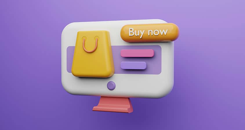
10. ‘Buy Now’ button
This is like an ‘express checkout’ button and usually means users can pay immediately, instead of going through the cart and checkout pages. It’s available from some payment gateways. It can also mean that the rest of your website might need a slightly different setup, but it can streamline the purchase process, which is good for business!
11. ‘Customers also bought’ section
People feel more comfortable doing things that other people are doing. This section plays on that quirk of our psychology and encourages users to purchase things other customers have already bought. Your customer might think, “If they bought it, they must see it as valuable and I might need it too!”
12. ‘You might also like’ section
This section displays more products, most likely related to the product on the page. It’s another effort to upsell customers by encouraging them to buy more.
You could even sell this space to advertisers and turn your ‘related products’ into another revenue stream.
13. Product details
This is the LONG description of the product. Here you can put as much detail about your product as possible. Make sure to use your target keyword again here, and explain every element, specification, benefit, and use of your product in detail. This will probably be a lot of information so it would help to split it into headings like:
- Color
- Brand
- Product specifications (make, model, battery life etc.)
- Indoor / outdoor usage description
- Special features
- And anything else that could be relevant for customers to know
14. Warranty or returns policy
Customers want to know what will happen if your product breaks, or isn’t what they expected. When buying online, they are trusting you to deliver what you say you will, but sometimes their expectations are different from the product you’re describing.
Use this short paragraph to explain your warrantee and returns policy. Can they return the product? Will they get their money back? Will they need to pay for return shipping? Must they include all the packaging? What if the product doesn’t work on delivery, or breaks soon after? Answer all these questions here.
15. Videos of the product in use
Lots of people are visual learners, and some things are must more difficult to explain in words. In these cases, videos can be really useful. Display videos of people using your product, assembling it, adjusting it, updating it, or making minor repairs.
These videos are great for user engagement and might just turn a reader into a buyer!
16. Frequently asked questions
Your product description may be excellent, but it might not be able to cover everything. ‘Frequently asked question (FAQ)’ is an easy way to answer customer concerns all in one place.
- Can it be used in XYZ situation?
- What if my child bites it – will they get hurt?
- Can it be used with this other product ABC?
People have a lot of questions! Add in a form where they can ask new questions that you haven’t yet answered here.
17. Full reviews from customers
People want to know what other people think of the product! When they buy from you, they need to trust that they are getting the product they expect, and that it works in the way they expect it to.
Customer reviews can help users to understand what they are buying. Positive reviews can sell your products for you!
If this section is automated, you might see users leaving negative reviews. You can gather useful feedback and suggestions from negative reviews – it can help you to change the elements of your product that aren’t working.
Remember to make sure that only customers can leave reviews, so you can be sure they are as accurate as possible. You don’t want someone who’s never bought your product to be able to leave a review.
Add a space for customers to write a review so new customers can leave reviews too.
Now your ecommerce product pages are optimized!
Now that you know what to include on your shop product pages, it’s worth checking on other page elements on the pages too. You’ll create the best user experience possible (which is great for users and search engines) by making sure everything works well together.
Check the ecommerce product page speed and mobile responsiveness, to make sure your page works perfectly on mobile.
Every little upgrade helps to make sure your users click that ‘Add to Cart’ button!
If you need help or have more questions, please contact us.